Redesigning Finding Focus's landing page to make Finding Focus feel clearer, more credible, and more worth signing up for.
My Role
UX Designer
Team
Mike Mrazek, Co-founder
Thomas Kennedy, SWE
Timeline
Sep – Nov 2025
The Problem
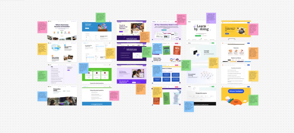
Finding Focus's original landing page had been around since the company's early days. It no longer matched the audience we needed to persuade. Because teachers are the ones who decide whether Finding Focus gets brought into the classroom, the page needed to speak directly to them. Instead, much of the messaging and framing centered the student experience.
The original landing page — a student-first design that wasn't speaking to our primary audience
Click the image above to view the full landing page design
Project Goal
The goal for this project was simple: create a kick ass landing page that helps teachers understand the value of Finding Focus and gets them to sign up.
Align With Audience
Update the landing page to speak directly to teachers since they are the user group responsible for driving adoption of Finding Focus.
Update Visual Design
Modernize the design of the landing page to help make a good first impression and to communicate the quality and maturity of the product experience.
Include Trust Signals
Introduce testimonials, social proof, and clearer reassurance around the product's value – all key confidence-builders to drive sign ups.
You caught me at an awkward breakpoint 🫣
North Star
Convert skeptical teachers into sign-ups by making a great first impression and building confidence in the product.
Research
Reviewing other edtech landing pages gave me a better sense of what strong pages in the space were doing well and how we could improve our own. It helped me think through how we should introduce the product, communicate its value, and build trust with our audience.
Competitive audit of edtech landing pages — screenshots and sticky-note notes from FigJam file I created
Visual Identity
To kick off the re-design of this page, my team and I sat down and began to work on defining Finding Focus's visual identity – which was lacking. It's hard to create a compelling landing page without a sense for what the visual identity should be and what the page should visually communicate. We knew we wanted our visual identity to convey: cool, modern, mature, and science-based – but we still needed to settle on a design style. One of the ways we as a team were able to tackle this was by sharing our existing assets and going over possible design styles we could lean into.
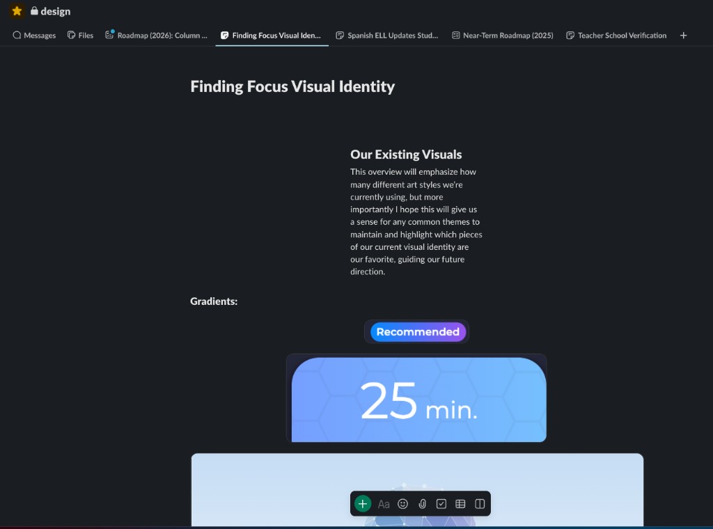
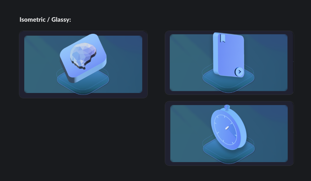
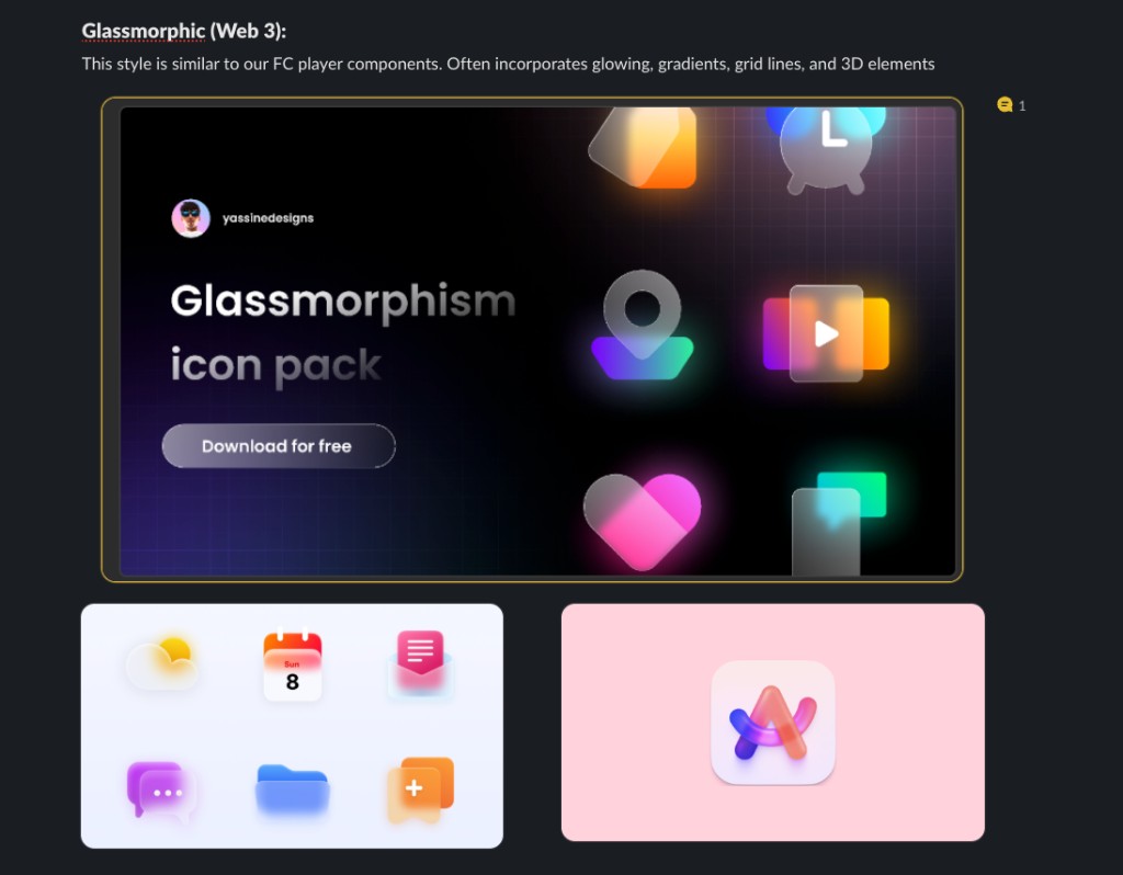
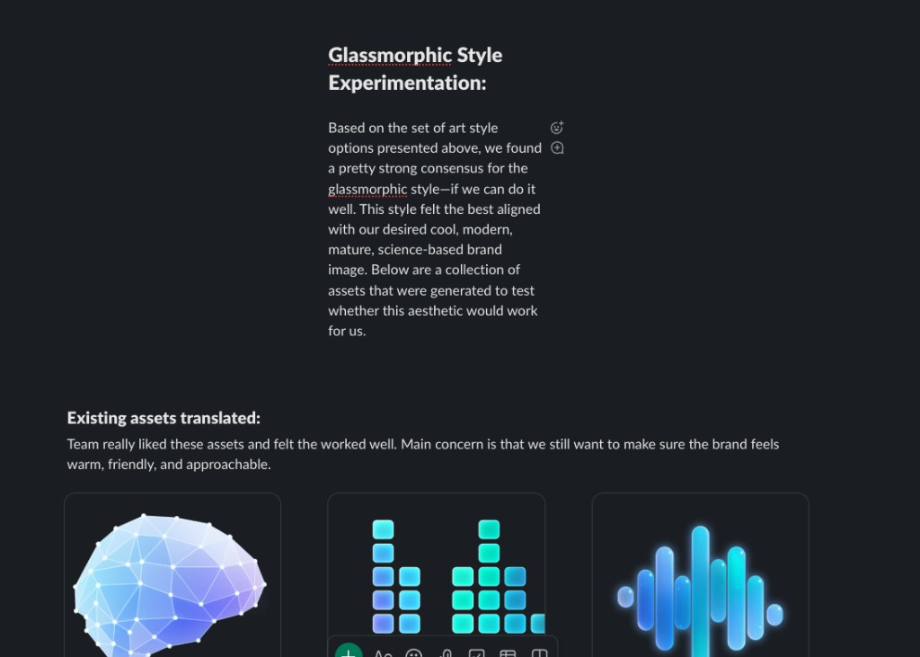
Slack Canvas created to go over our current visual identity
Messaging
As I began working on the page, I kept coming back to a few simple questions: What is Finding Focus? Why should a teacher care? And why should they trust it? One activity we did as a team to help answer these questions was to imagine ourselves as teachers and map out their story from the ground up — identifying their goals, their frustrations with student distraction, and what it would take for them to trust a solution like Finding Focus.
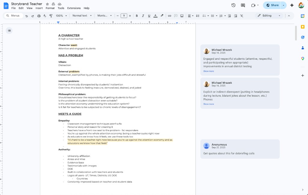
Google Doc we used to map out the teacher's narrative
Hero
I used the hero section as an opportunity to frame Finding Focus around outcomes teachers care about, highlight the product's credibility, and put a clear sign-up path front and center. That way, teachers could quickly understand the value of the platform without having to piece it together themselves.
A hero designed around teacher outcomes, credibility cues, and a clear path to sign up
Credibility Strip
I placed credibility signals directly below the hero so teachers could quickly see Finding Focus's legitimacy. By mentioning the university backing, educator involvement, and US DOE funding - the page is able to build trust early instead of making users question the legitimacy or search for it later.
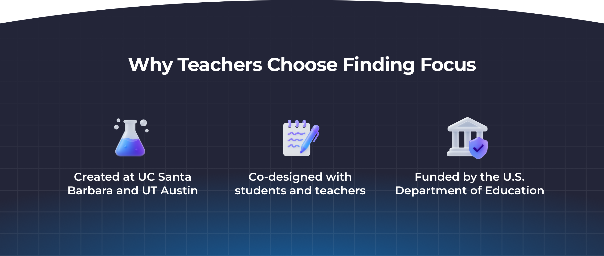
Three trust signals along with custom icons I created to add visual intrigue
Product Overview
One of the biggest problems with the original landing page was that it described Finding Focus without really going over the full product offering. I decided to show off the different offerings Finding Focus has by creating abstracted versions of the interface. These assets helped make the product easier to understand at a glance by showing the core parts of the platform in a way that felt clear, cohesive with the rest of the page, and easy to scan.
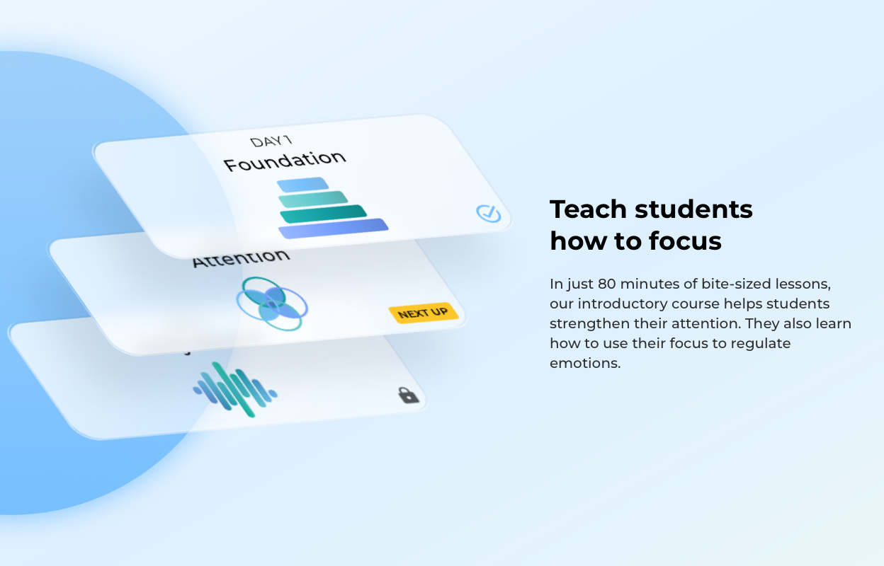
10-day course
Evidence Base
Finding Focus is grounded in research, and we really wanted to highlight that. Creating a research section helped us surface our measured outcomes in a way that demonstrate our value and would be relevant to teachers.
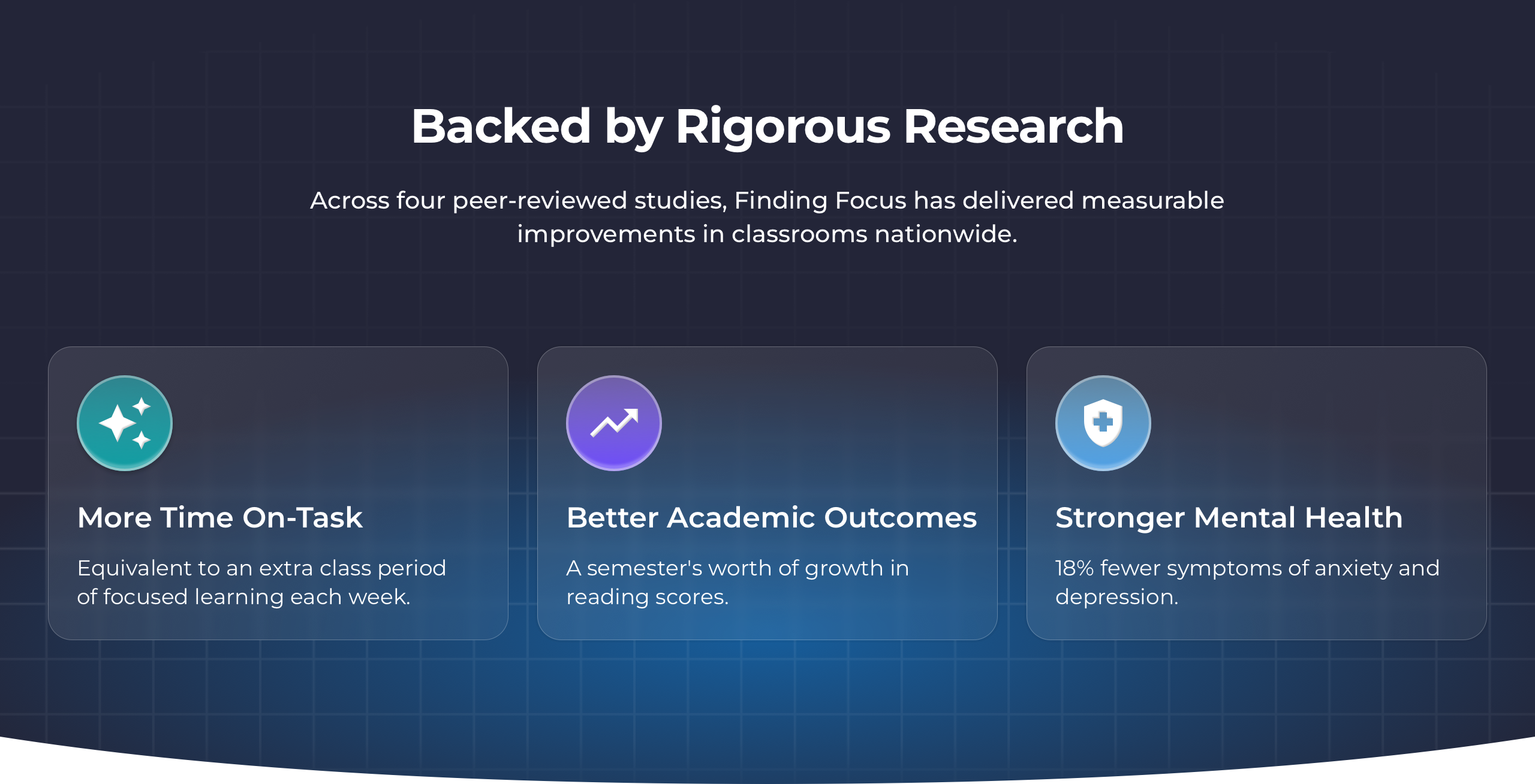
I designed glassmorphic cards to show off Finding Focus's most impressive outcomes
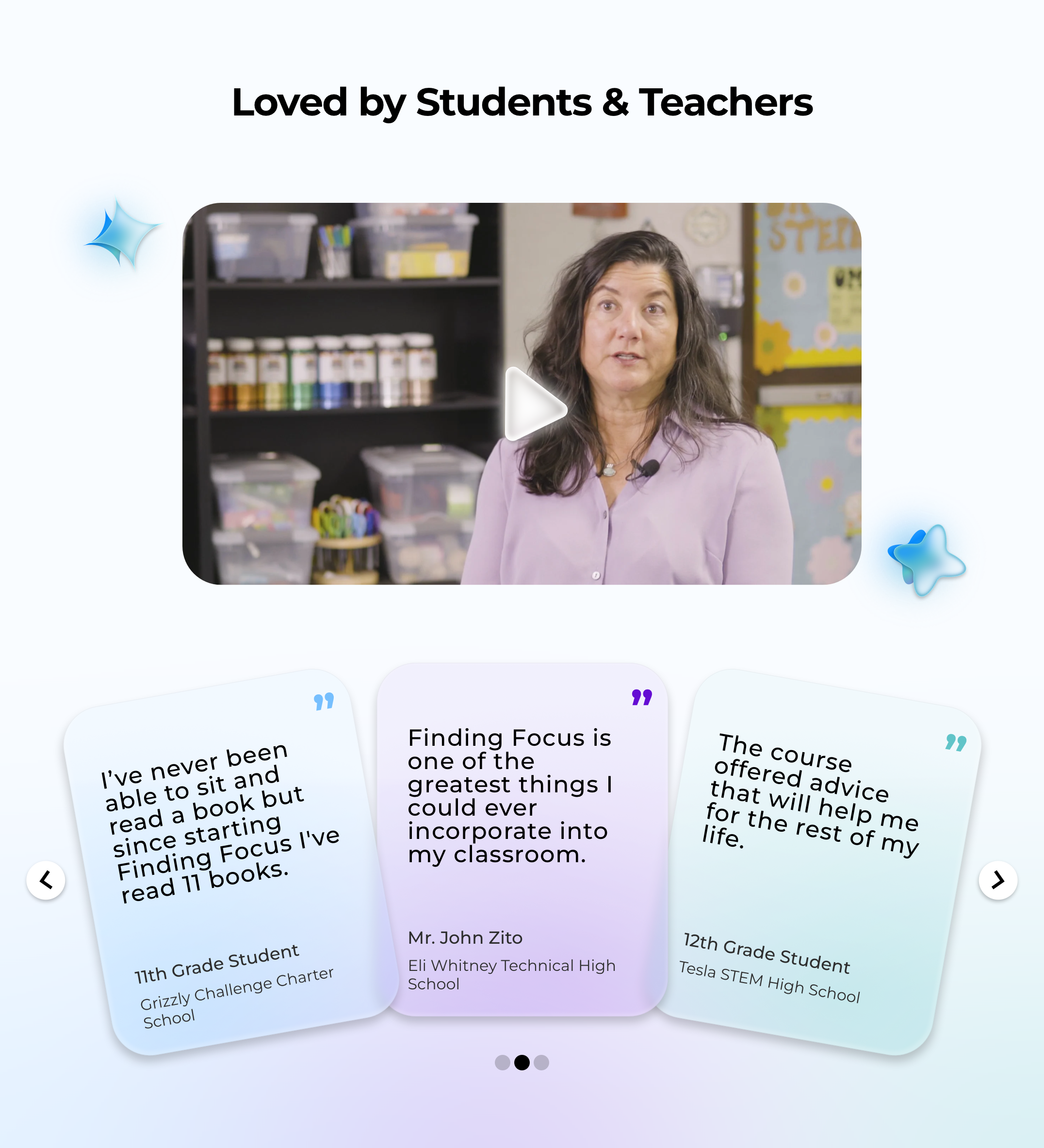
Testimonials
Testimonials were one of the clearest missing pieces from the original landing page. Bringing in real perspectives from both teachers and students helped make Finding Focus feel more credible, more human, and more proven in practice — all important for getting teachers to sign up.
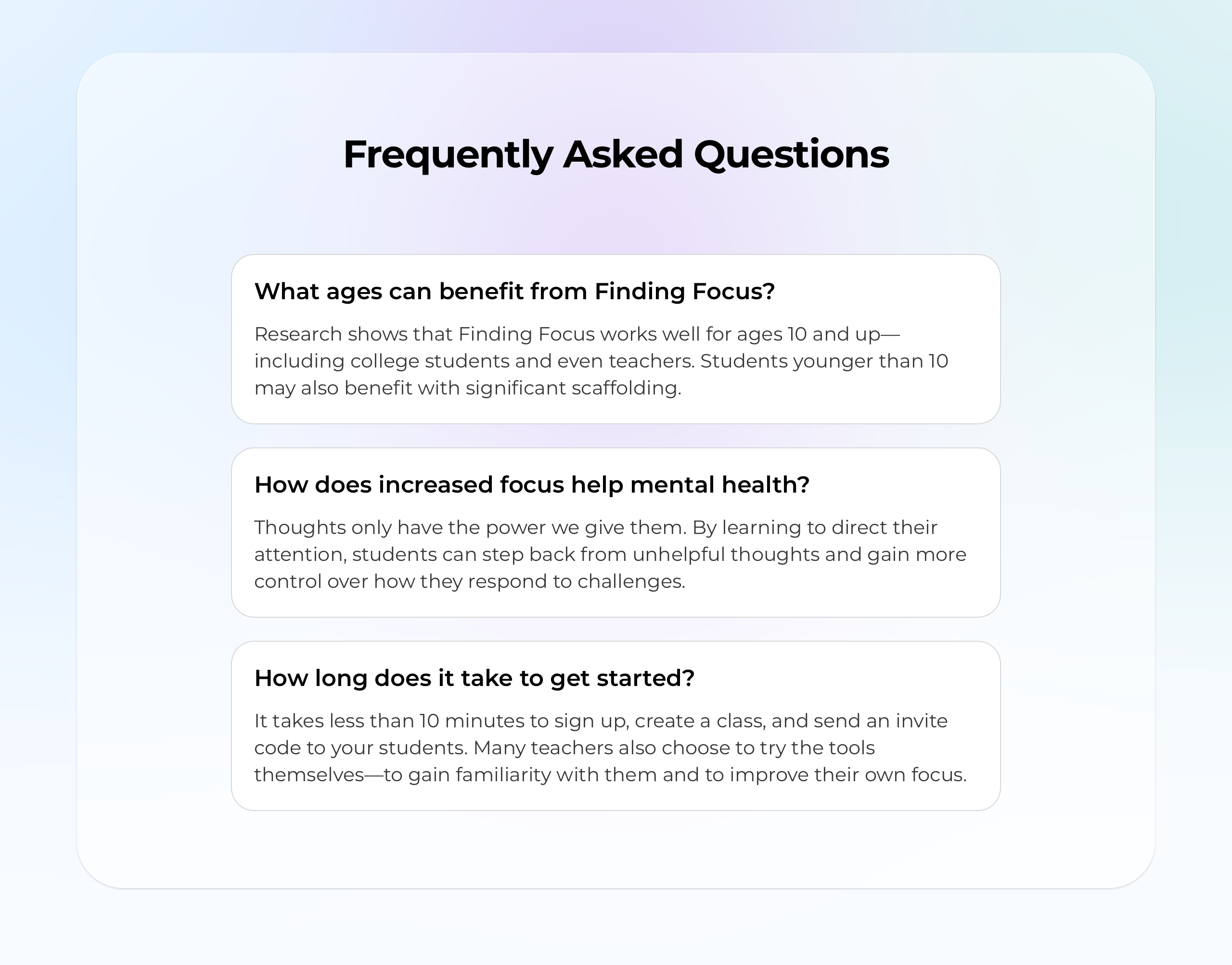
FAQ
Talking with my co-founder, we decided on a few ideas that were important to clarify and get across to our audience. The FAQ section helped us answer practical questions around who Finding Focus is for, why it matters, and how easy it is to get started — all of which helps reduce hesitation before signing up.
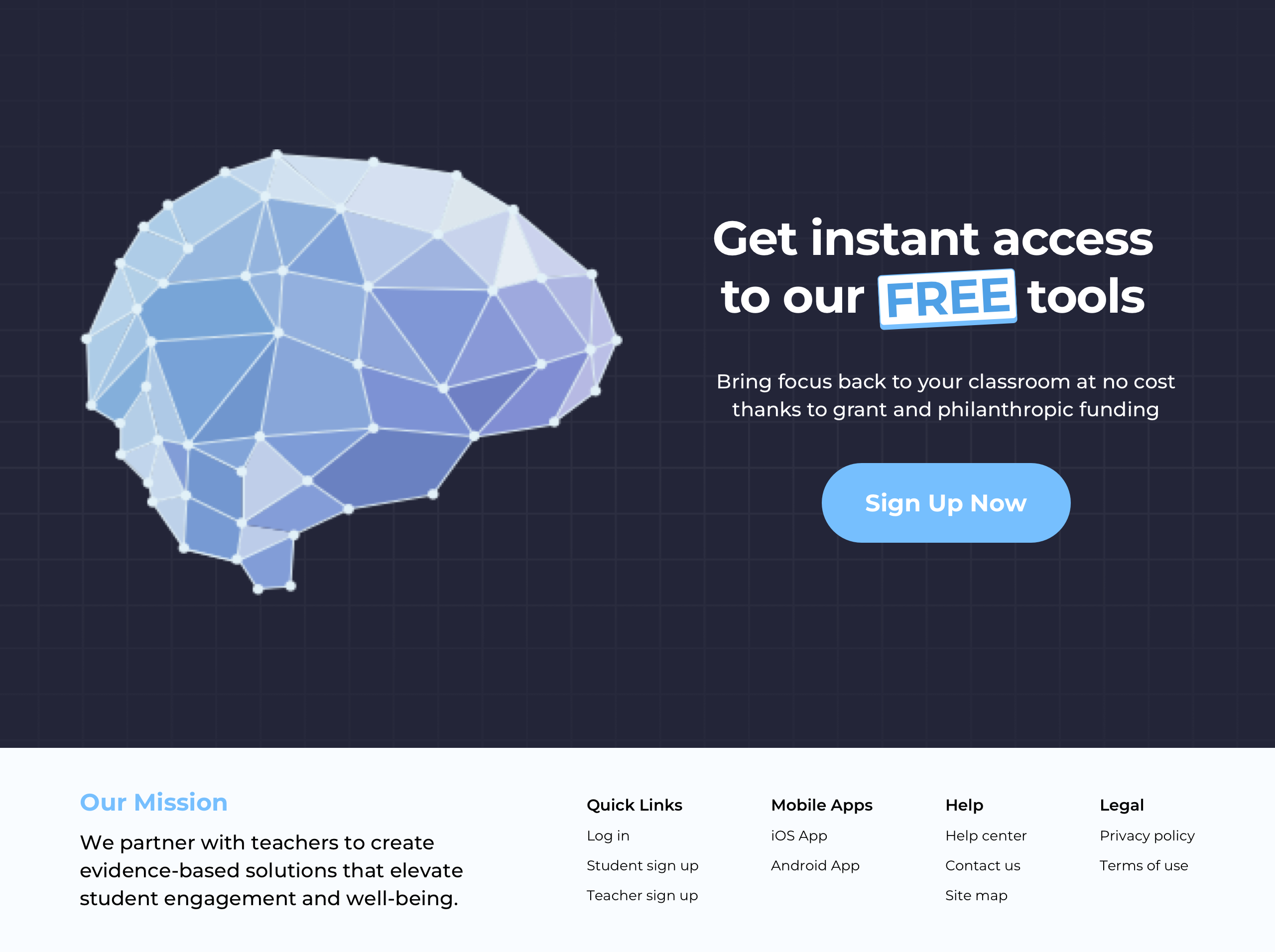
Final CTA
After spending the page building clarity and trust, I wanted to use the final section to really push conversion. I treated it almost like a second hero section — giving teachers one clear action to take, while reinforcing that getting started with Finding Focus is free and easy.
Full Design
The complete landing page — all sections, from hero to footer.
Click the image above to view the full landing page design
Animating different assets provided an extra opportunity to make the page feel more engaging and delightful. Rather than using motion everywhere, I focused on a few places where it could support the content, improve the experience, & create a strong brand moment.
Product Overview
These product overview assets use CSS keyframes animation to animate on scroll.
10-day course card animation
Testimonial Cards
These testimonial cards animate (as if on a wheel) when users click an arrow to view more.
Testimonial card carousel animation
Final CTA
This final CTA section reuses a lottie that was created of Finding Focus's logo.
Final CTA animation
Reflections
I’m a product designer by nature, but as the sole designer at a small startup, I’ve had to wear a lot of different hats. This project was a good example of that. Redesigning the landing page meant stepping into more traditional marketing and brand design work, while still relying on the same kind of strategic thinking I use in product design.
See the live landing page in action
The redesigned page is live at findingfocus.app