 Finding Focus • Edtech • Product Design
Milestone
25 Sessions Completed
Team
Mike Mrazek, Co-founder
Thomas Kennedy, SWE
Timeline
Jan – Jul 2026
My Role
Sole Product Designer
TL;DR
Students weren't coming back to the Focus Coach — and the end of a session was where we lost them. I redesigned it into a guided flow with a simpler reflection, celebratory achievements, and a brand-new completion screen, built to motivate without manipulative tactics.
89
students surveyed on rewards and motivation
3
achievement types, each with its own animated screen
22%
less time spent rating focus at the end of a session
Context
It's a guided study timer that helps students stay on task while doing their work by periodically checking in on them.
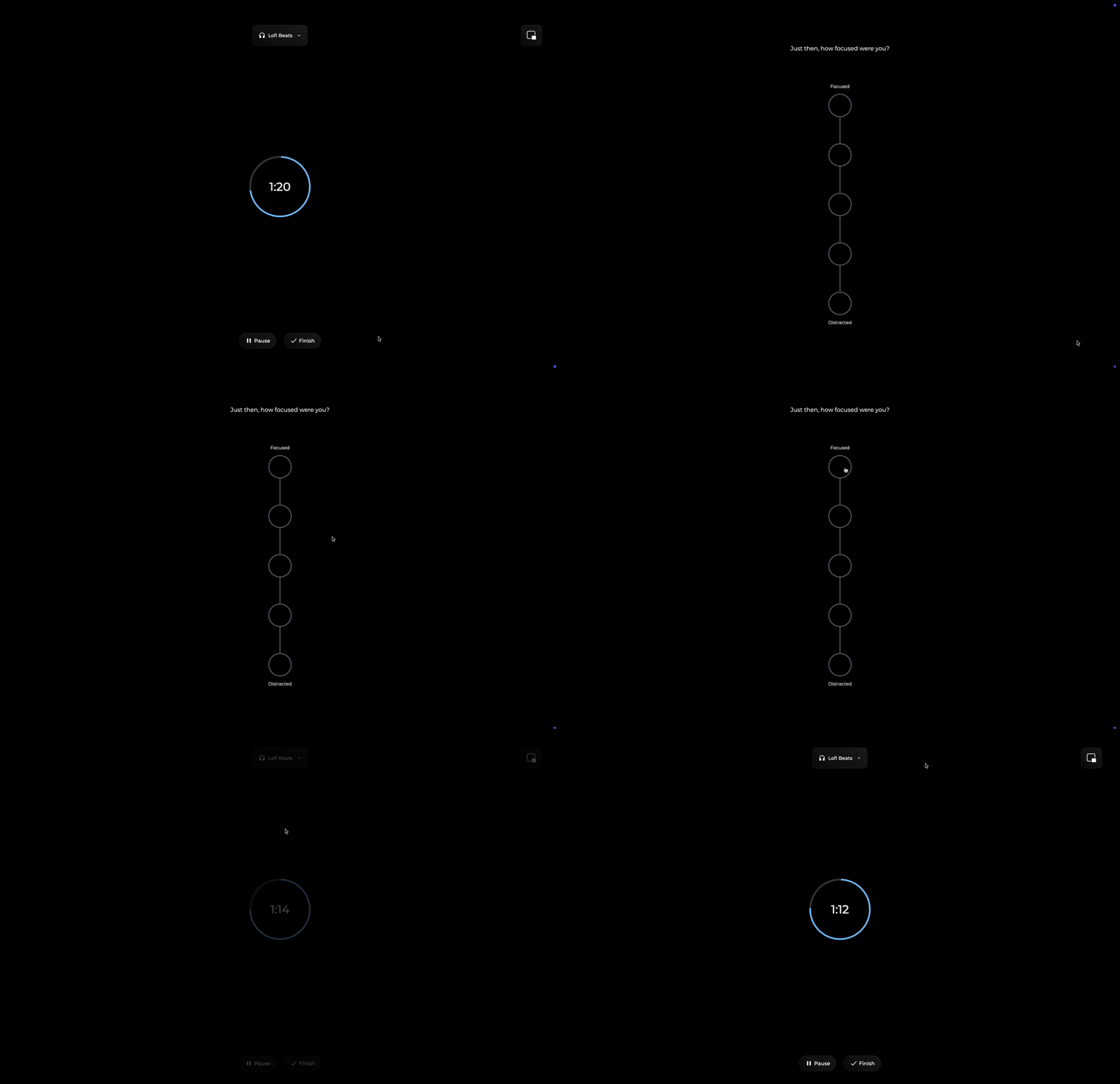
What a check-in looks like during a Focus Session
The Problem
39.3% of our users were one and done after completing their first session – meaning almost 2 in 5 of our users completed a single Focus Session and then abandoned the tool.
39.3%
of users only ever completed one Focus Session
54.6%
of all sessions were completed by the top 1% of users
Hypothesis
Every session ended with a brief "session complete" animation, a 1–100 reflection slider, and an MVP-state completion screen built around a check-in graph. We’d assumed students would rack up check-ins, but most sessions only had one or two, which meant the graph had little value.

This is what the previous end of session flow looked like. If students did not have a check-in the graph provided no value
Project Goals
Feeling seen
The end of a session should acknowledge the effort users put in.
Celebrating real progress
Sessions should acknowledge real progress users have built up, not empty praise.
Quick honest reflection
Taking a moment to look back on how a session went shouldn’t require a lot of cognitive effort.
North Star
Turn the end of every session into an opportunity to delight and engage users
Student Signal
A survey we sent out to students asked: "If you could earn badges or unlock levels by completing more sessions, would that make you want to use the Focus Coach more?" Roughly half said yes and another third said maybe.
Survey responses
Would badges or levels make you use Focus Coach more?
n = 89 students
Competitive Audit
I audited the end-of-session experiences for six of the biggest mindfulness and timer apps. The best experiences used the end of a session as an opportunity to celebrate the user and promote future engagement. Something ours failed to do.
Gamification Question
Our survey showed that students supported the idea of badges and rewards, and the competitive audit found that similar applications used gamification. But despite that, full gamification wasn't something I recommended: Finding Focus exists to help students genuinely improve their focus, not to collect rewards. The moment a badge becomes the reason a student starts a session, the tool is failing at its actual job.
Behavioral Insight
One student completed hundreds of one-minute sessions to win a teacher’s prize.
This was a clear signal that attaching rewards to usage can lead to users gaming the system.
Content Ideas
Without wanting to lean too heavily into gamification, I proposed four kinds of content we could show: cumulative milestones, personal bests, streaks, and course quotes.
My team was in full support so I got to work creating designs and a spec sheet of the full system – trigger logic, thresholds, priority rules, and the copy.
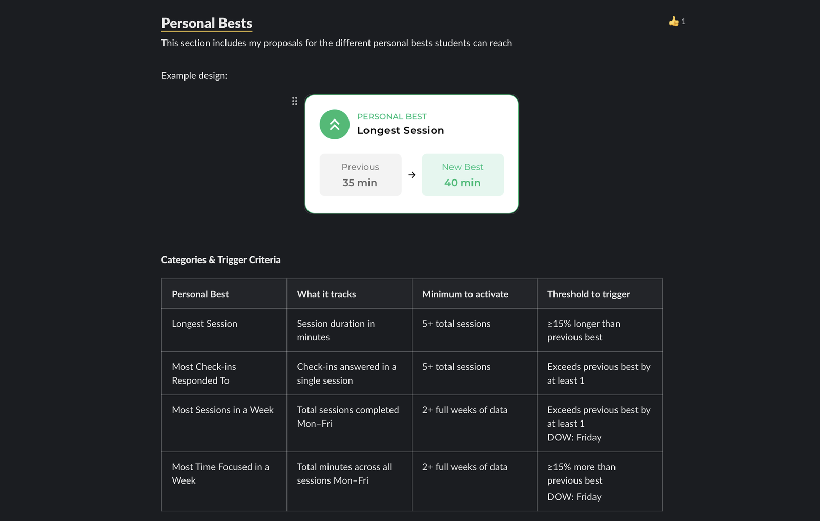
Screenshot from a Slack canvas documenting Personal Best criteria — trigger logic, thresholds, and copy.
Streaks Behavior
Our team had long considered adding streaks, but my background in behavior analysis made me cautious. Streaks often trigger a 'streak maintenance mode,' where users return to an app purely to keep a number alive rather than to engage meaningfully. That’s a classic dark pattern, and one we specifically wanted to avoid given that Finding Focus serves K-12 students.
Dark Pattern
Streak Maintenance
Streaks can often be manipulative; exploiting psychological biases like loss aversion to coerce users into daily engagement.
My solution to the streaks dilemma was to make it something that users earned rather than maintained. As long as a user completed at least one session each weekday (Monday - Friday) they were able to earn a Focus Streak for that week. Once users earned one there was no risk of losing it, and they could earn as many as they wanted.
Nice job completing a session every day this week!
A custom animation I created that plays when users earn a Focus Streak
Early Mockups
The original idea was to rotate through different content on the completion screen and show whatever was relevant to the session a user just completed, so the page always had something fresh to show.
Early rotating-content concepts for Milestones, Personal Bests, and Quotes
Early rotating-content concepts for Milestones, Personal Bests, and Quotes
The Realization
The idea for a completion page that rotated through different content worked in theory, but once I began creating mockups it became clear that the design wasn’t working.
That’s when I realized the best experience would be a guided end-of-session flow where each piece of content - if it was triggered - had its own dedicated screen and a purposeful animation.
Reflection
Confirms the session ended, shows its stats, and asks users to rate their focus.
Achievement
A full-screen celebration when a streak, milestone, or personal best is reached.
Completion
All-time stats plus either the week tracker or a course quote.
End of Session Logic
The flow adapts to each session — the achievement screen only appears when one is earned, which is what makes it a special moment
Personal Reflection
The redesign does three jobs: acknowledge the session has ended, provide context on what was accomplished, and allow users to quickly reflect.
A persistent checkmark and "Session Complete" title signal the end of the session.
Session stats show what was just accomplished: how long the session was and number of check-ins.
One question about their focus, four options, less cognitive load.
During that session, how focused were you?
The new design showed users more clearly that their session had ended and allowed them to quickly reflect on it.
Achievement Screens
In order to elevate the experience I created three different vector illustrations to distinguish the three different achievements. I was then able to animate the illustrations using CSS Keyframes with the help of Claude Code.
Milestone
25 Sessions Completed
Milestones — one of three tracks users progress towards: total sessions, total time focused, and total check-ins answered
The Completion Screen
All-time stats count up odometer style, showing users how this session added to their all-time progress. Below the stats container sits one of two containers: a week tracker or a course quote. If it is the first session of the day then the week tracker is shown, if not then the course quote container is shown.
All Time Stats
Complete a session every day this week to earn a streak!
Week Tracker — shown after the first session of the day, gently encouraging a session every weekday
Final Design
The end of session flow users see after completing their first session

Personal reflection — mobile, dark mode
Achievement screens — mobile, dark mode
Completion screens — mobile, dark mode
Launch Status
Since this project launched in July (2026), when most students are out of school and classroom usage is naturally lower, we do not have enough data to draw any conclusions yet. To determine if we successfully improved the end of session experience, I set up clear goals to track performance for the Fall semester.
Leading Indicators — early usability & engagement
Reflection friction
ObservedTime spent rating focus is already down 22% — an early signal that simplifying the reflection screen lowered the cognitive load.
Focus Streak completion
TrackingTrack the percentage of students who achieve their first Focus Streak to confirm that the reward is both attainable and motivating.
Lagging Indicators — core retention metrics
First-session retention
TargetReduce the baseline 39.3% single-session abandonment rate to under 25%.
Session distribution
TargetReduce the percentage of total sessions completed by the top 1% from 54.6% to under 30%.
Restraint
Early research showed that almost half of students would have been in favor of badges and levels. But leaning fully into gamification would have made collecting badges the point of using the tool. Choosing streaks, milestones, and personal bests gave us a way to celebrate effort without turning focus into a currency.
Designing for context
Students aren't using this app in a vacuum. They don't control when classes meet or when homework happens. Making streaks roll over week-to-week instead of being something students have to maintain day after day removed cheap loss-aversion tactics and respected how students actually use classroom tools.
Try the end of session experience yourself
Shipped to production in July 2026 — live at findingfocus.app